WEEKEND HACKTHON
WEEKEND HACKTHON
Big Basket
Improving the delivery slot screen to reduce chances of cart abandonment.
Big Basket
Improving the delivery slot screen to reduce chances of cart abandonment.
ABOUT UXhack
ABOUT UXhack
UXHACK is an online platform for product and design professionals to learn, compete, and grow by participating in weekly design hackathons, offering opportunities to improve skills, showcase creativity, and earn rewards.
UXHACK is an online platform for product and design professionals to learn, compete, and grow by participating in weekly design hackathons, offering opportunities to improve skills, showcase creativity, and earn rewards.
UXHACK is an online platform for product and design professionals to learn, compete, and grow by participating in weekly design hackathons, offering opportunities to improve skills, showcase creativity, and earn rewards.
team
Solo
Solo
Solo
Timeline
48 hours
48 hours
48 hours


hackathon context
What was the problem?
What was the problem?
BigBasket is an online grocery provider in India. They source fruits and vegetables daily from local markets, store them in refrigerated warehouses, and use temperature-controlled trucks for delivery. Customers can select a delivery slot for the same day or a future delivery date/slot during checkout.
We had to improve the highlighted section of the screen to reduce cognitive load for first-time users of the product. Certain assumptions were allowed regarding the delivery slots shown, with the focus solely on enhancing the user experience within the specified area.
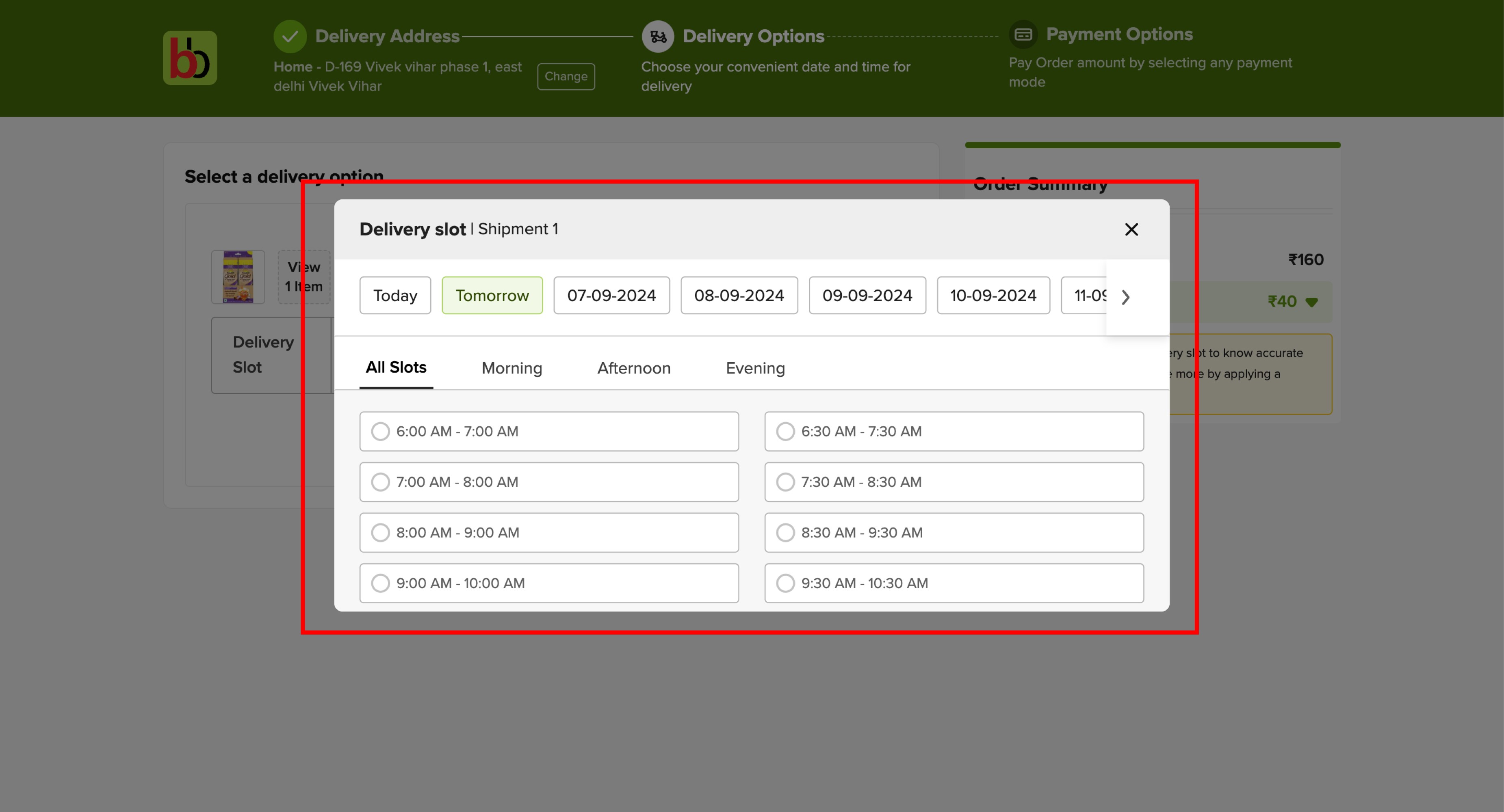


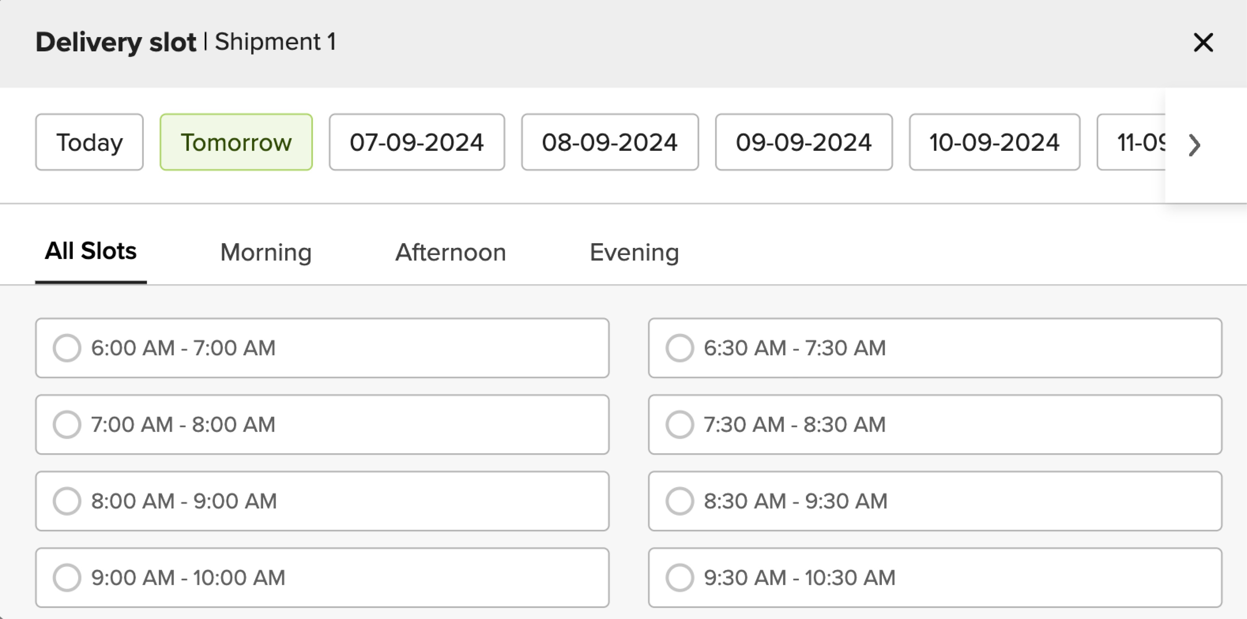
Highlighted section that was to be redesigned.
Highlighted section that was to be redesigned.
The issues I identified.
The issues I identified.
Issues identified.
Lot of cognitive load
There is a lot of cognitive load, specially for a first time user of the product due to the choice of so many options to choose from.
Risk of cart abandonment
As the final step before payment, this screen carries a higher risk of cart abandonment due to increased cognitive load.
Visual clutter/unnecessary information
Difficult to navigate all the dates and select one incase someone wants a delivery for a future date.
Displaying unavailable slots adds unnecessary visual clutter to an already information-heavy screen, making it harder for users to focus on available options.
Lack of visual hierarchy
Not much visual hierarchy for all the information on this screen, which impacts readability of the information.

proposed solution
Rethinking the screen.
Rethinking the screen.
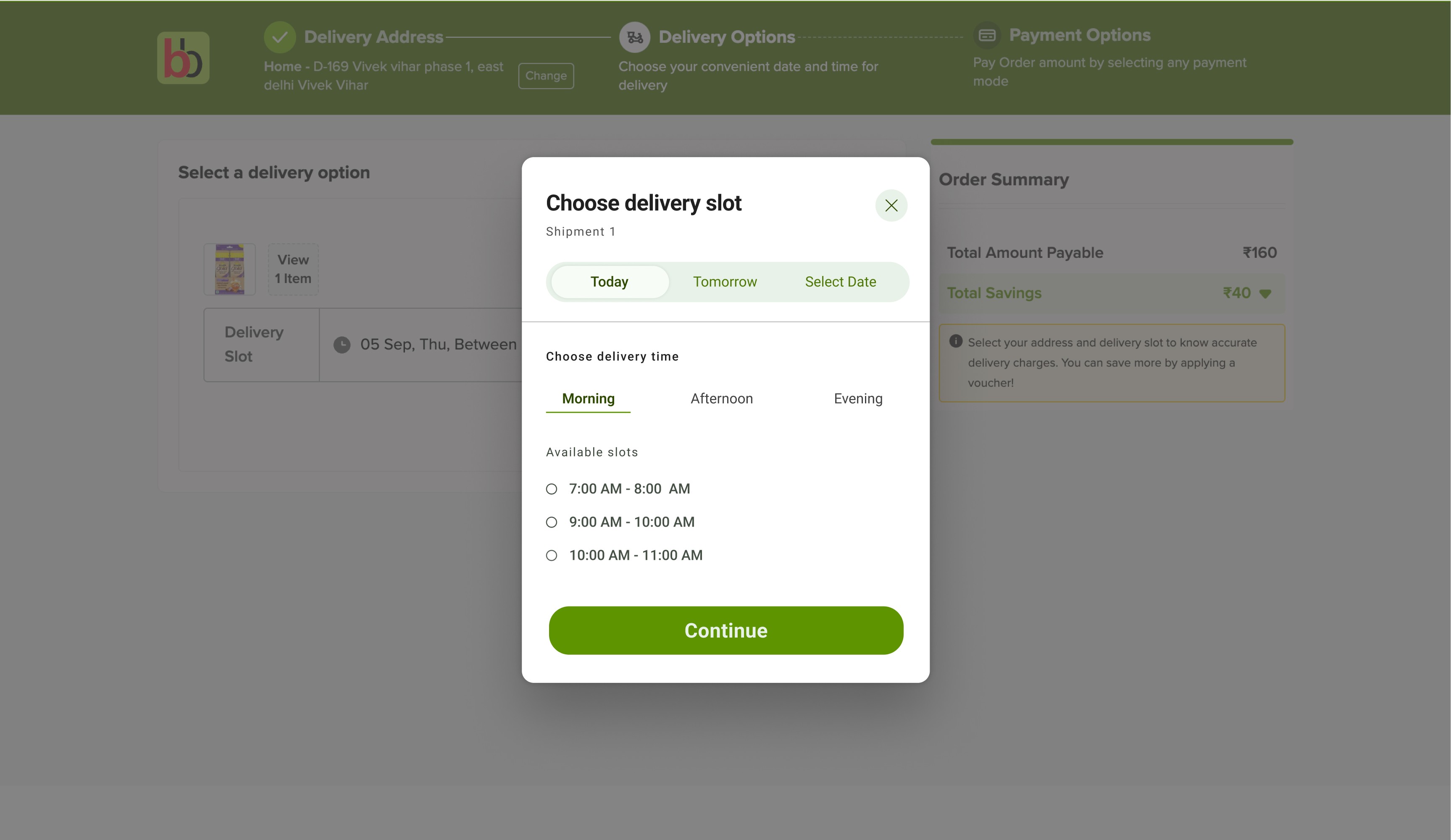
My design solution for the delivery screen.
My design solution for the delivery screen.
Focusing on reducing drop-offs and simplifying decision-making,
I chose to show only available slots.
Quicker decision making : Users make faster selections.
Reduced visual clutter: Only available options are displayed to reduce unnecessary info.
Instead of scrolling through a long list of delivery dates, I opted for a calendar view to simplify date selection.
Reduces cognitive load: Users can easily spot available dates without excessive scrolling.
Familiar interface: Users are used to selecting dates on a calendar view, making it intuitive and faster to choose a delivery date.
I ensured that the improved screen design featured a better visual hierarchy, grouping key actions like picking a date and selecting a time slot together. This helps users make decisions quickly and reduces cart drop-offs.
Showing only available slots
Calender view for delivery dates
Improved visual hierarchy
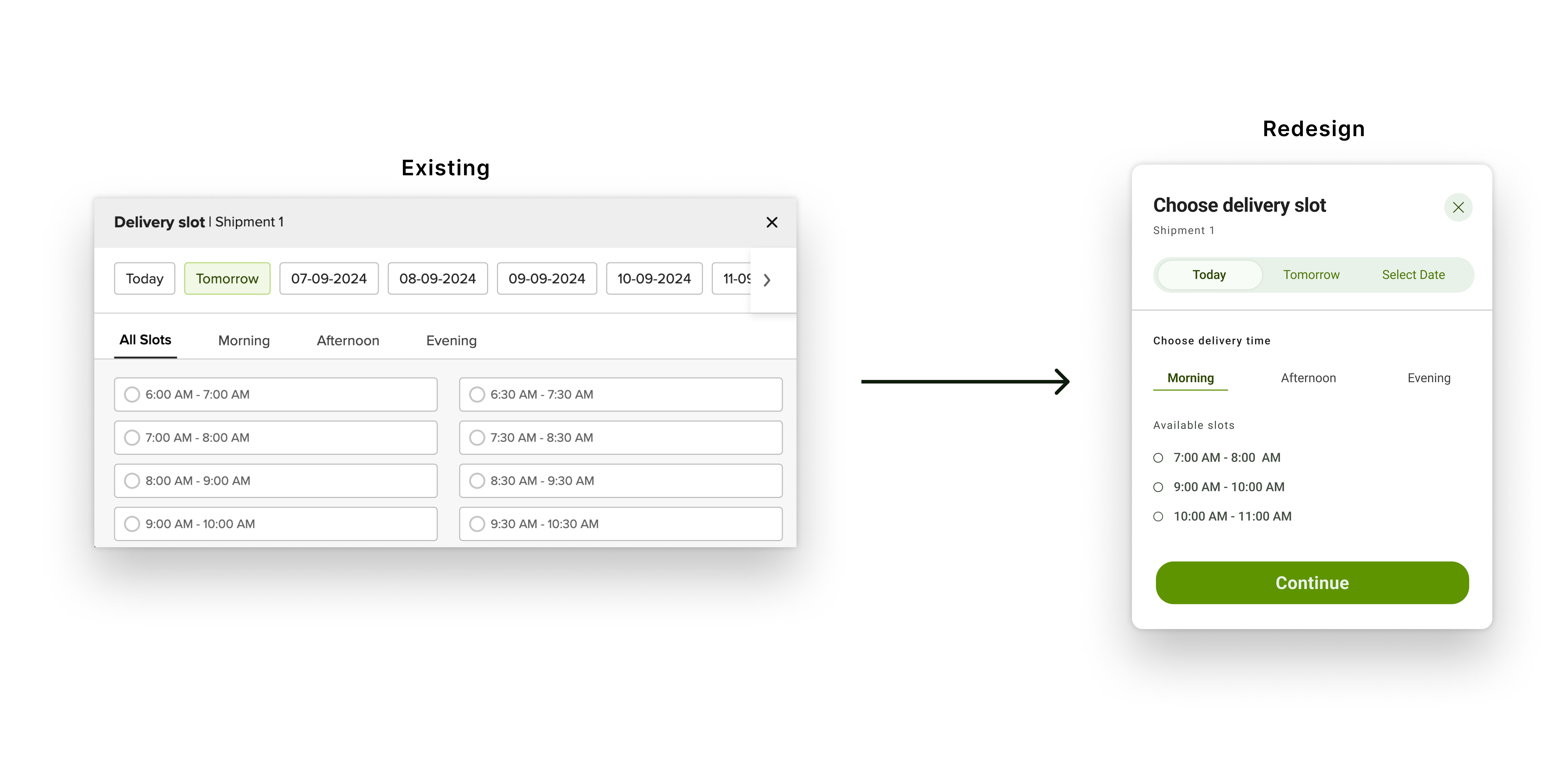
Key design changes that I made.
Key design changes that I made.
Showing only
available slots
Showing only
available slots
Focusing on reducing drop-offs and simplifying decision-making,
I chose to show only available slots.
Quicker decision making : Users make faster selections.
Reduced visual clutter: Only available options are displayed to reduce unnecessary info.
Calender view for delivery dates
Calender view for
delivery dates
Instead of scrolling through a long list of delivery dates, I opted for a calendar view to simplify date selection.
Reduces cognitive load: Users can easily spot available dates without excessive scrolling.
Familiar interface: Users are used to selecting dates on a calendar view, making it intuitive and faster to choose a delivery date.
Improved visual
hierarchy
Improved visual
hierarchy
I ensured that the improved screen design featured a better visual hierarchy, grouping key actions like picking a date and selecting a time slot together. This helps users make decisions quickly and reduces cart drop-offs.
feedback
Words of encouragement 🙌
Words of encouragement 🙌
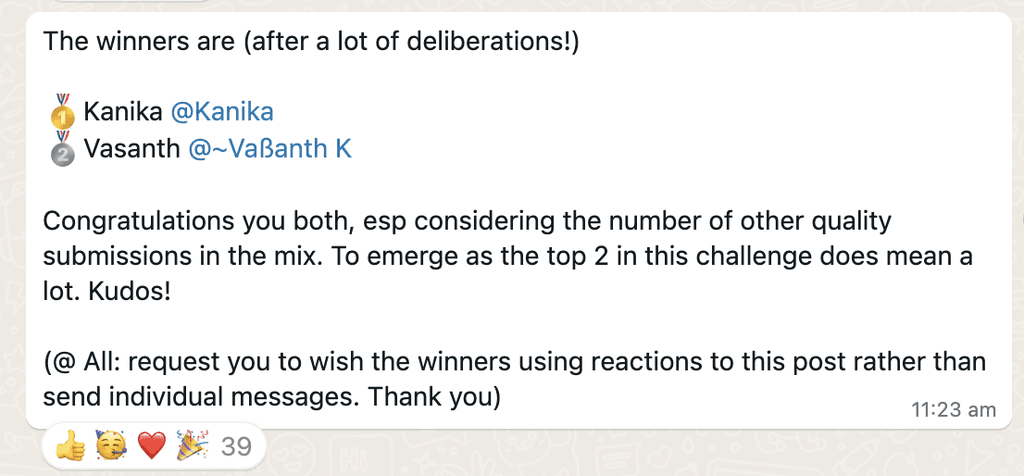
My solution was chosen as the top entry out of 34 submissions. It was encouraging to receive feedback from industry professionals such as Akshay Kanade and Nishith Gupta, co-founders of UXHack.
My solution was chosen as the top entry out of 34 submissions. It was encouraging to receive feedback from industry professionals such as Akshay Kanade and Nishith Gupta, co-founders of UXHack.
My solution was chosen as the top entry out of 34 submissions. It was encouraging to receive feedback from industry professionals such as Akshay Kanade and Nishith Gupta, co-founders of UXHack.



learnings and reflections
If I had more time.
If I had more time.
Based on previous orders, recommend slots that the user often prefers.
Show environmentally friendly options like bulk delivery routes (if available) to reduce the carbon footprint.
A subtle nudge like "Recommended" or "Fastest Delivery" on specific time slots to encourages users to select those options without overwhelming them with too many choices.
More Projects
Lavender
→
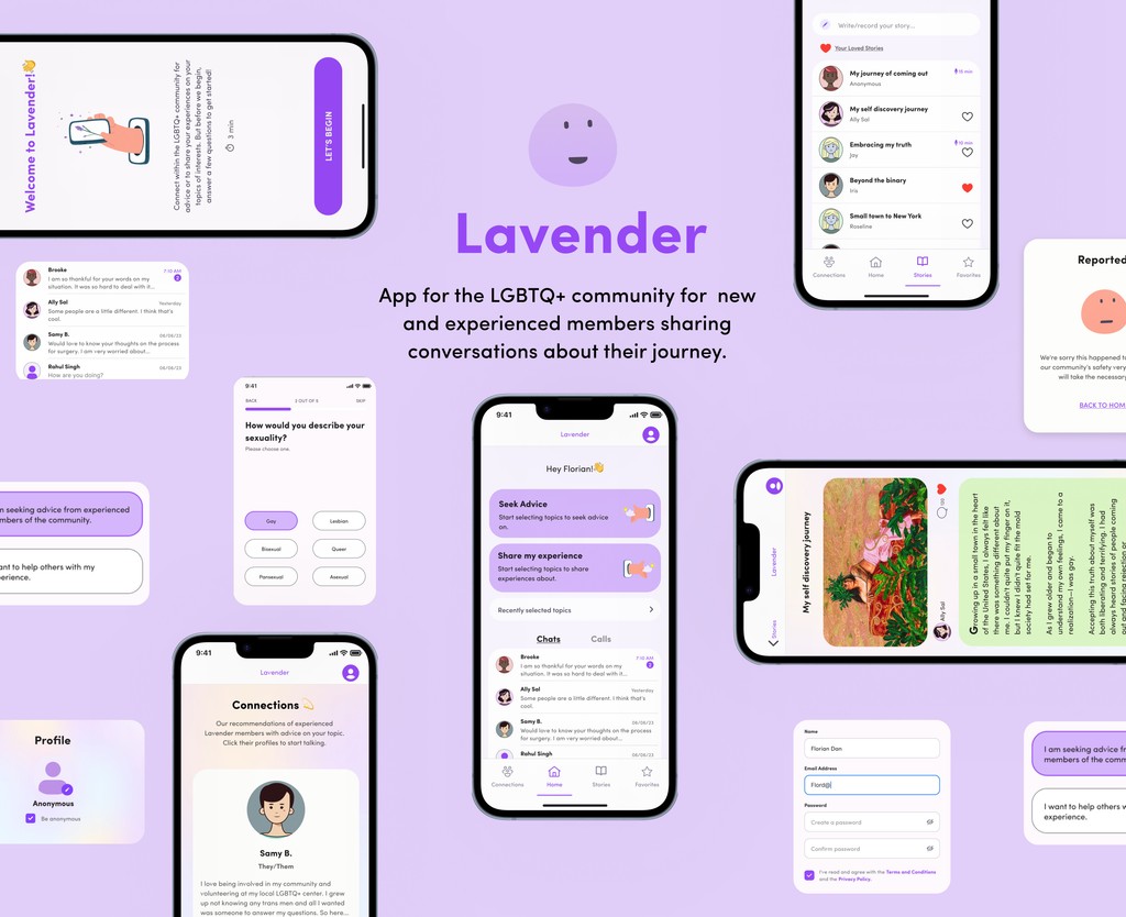
Using design to bridge the gap for isolated LGBTQ+ individuals.
Sirona Hygiene Foundation
Sirona Hygiene
Foundation
→
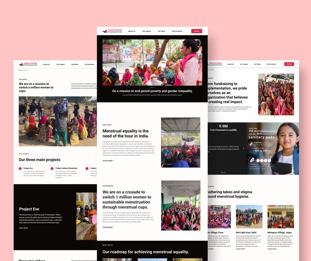
Redesigning the NGO's website to elevate storytelling, highlight impact, and boost CSR donations.
Thank you for making it to the end 👋
Let's connect to collaborate and create together.
More Projects
learnings and FUTURE OPPORTUNITIES
feedback
Proposed solution
hackathon context
