
PROJECTS
Sirona Hygiene Foundation Redesign
Redesigning the NGO's website to elevate storytelling, highlight impact, and boost CSR donations.
My role
Stakeholder management, User research, Usability testing, Defining metrics, IA, Wireframing, Copywriting, Visual design, Prototyping
Timeline
2023
3 weeks
team
Kanika Talwar
Steven Tan
I led the design for the desktop
version of the redesign.
Project summary
This capstone project was completed as part of my UX/UI Bootcamp at UC Berkeley Extension. It involved partnering with a non-profit organization to apply and showcase our UX skills.
As I led this website redesign, we tackled with problems such as the lack of user trust due to the homepage's failure to clearly convey the non-profit's mission/story. Additionally, their website failed to showcase their impact numbers and tangible work, resulting in fewer donations for the cause.
Initially, only 10% of users could even find their impact numbers. But through our extensive user research and thoughtful design, we managed to bring the success rate of this task to over 70%.
iNITIAL RESEARCH / problem Discovery
iNITIAL RESEARCH / problem Discovery
iNITIAL RESEARCH / UNDERSTANDING THE PROBLEM
UNDERSTANDING THE PRIMARY USER
Who is Sirona Hygiene Foundation?
Who is Sirona Hygiene Foundation?
Who is Sirona Hygiene Foundation?
In a lot of economically challenged sections of India, menstrual health issues are still considered taboo. Sirona Hygiene foundation tackles period poverty and gender inequality in India's economically challenged areas by donating menstrual cups to these underprivileged women as well as provides training and education for behaviour change to make the switch from cloth/pads to cups.
In a lot of economically challenged sections of India, menstrual health issues are still considered taboo. Sirona Hygiene foundation tackles period poverty and gender inequality in India's economically challenged areas by donating menstrual cups to these underprivileged women as well as provides training and education for behaviour change to make the switch from cloth/pads to cups.
In a lot of economically challenged sections of India, menstrual health issues are still considered taboo. Sirona Hygiene foundation tackles period poverty and gender inequality in India's economically challenged areas by donating menstrual cups to these underprivileged women as well as provides training and education for behaviour change to make the switch from cloth/pads to cups.

iNITIAL RESEARCH / understanding the problem
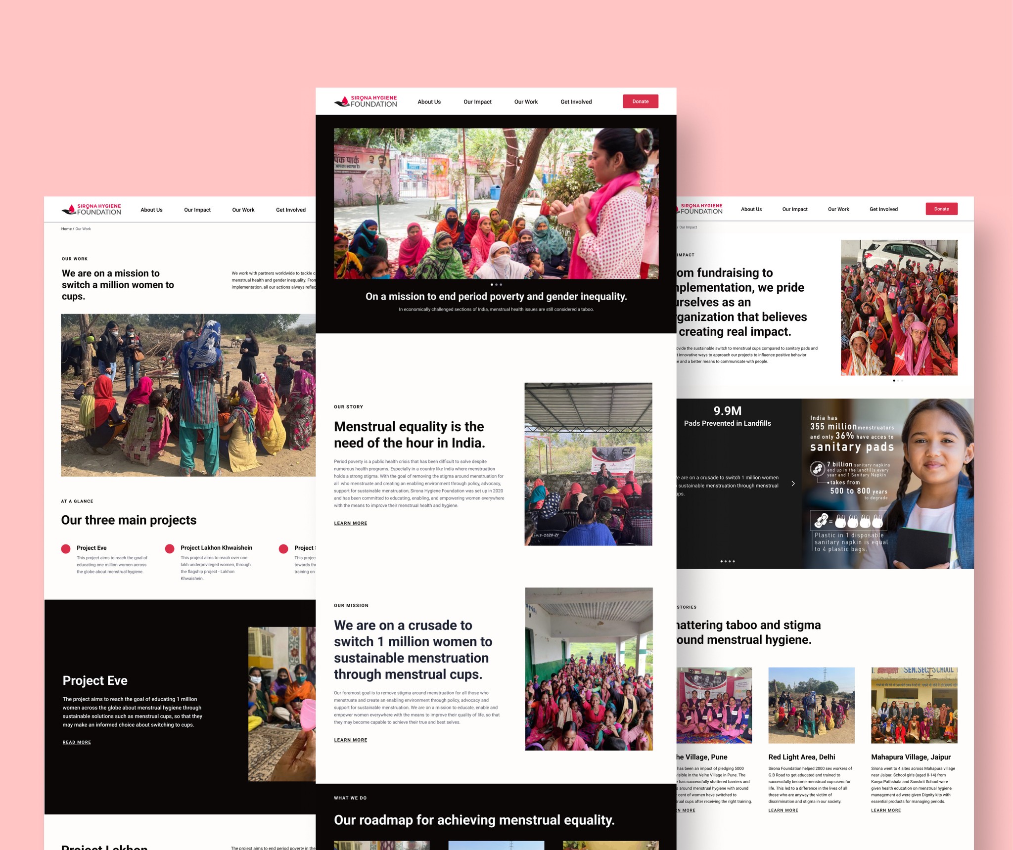
A glimpse of their existing website.
A glimpse of their existing website.
A glimpse of their existing website.
Sirona's challenge: lack of a compelling narrative about their mission and impact.
Sirona's challenge: lack of a compelling narrative about their mission and impact.
Sirona's challenge: lack of a compelling narrative about their mission and impact.
We began with stakeholder meetings to understand their thoughts on the existing website and its issues. We also discussed their vision for an ideal website.
We began with stakeholder meetings to understand their thoughts on the existing website and its issues. We also discussed their vision for an ideal website.
We began with stakeholder meetings to understand their thoughts on the existing website and its issues. We also discussed their vision for an ideal website.

Lack of a compelling story/narrative on Homepage
Lack of a compelling story/narrative on Homepage
Lack of a compelling story/narrative on Homepage
The homepage lacks a compelling narrative and clear story about Sirona's mission, making it difficult for users to connect and engage with the website.
The homepage lacks a compelling narrative and clear story about Sirona's mission, making it difficult for users to connect and engage with the website.
The homepage lacks a compelling narrative and clear story about Sirona's mission, making it difficult for users to connect and engage with the website.
Impact numbers and projects provide tangible proof of a non-profit's work on the ground, but these key elements are poorly presented on the current website.
Impact numbers and projects provide tangible proof of a non-profit's work on the ground, but these key elements are poorly presented on the current website.
Impact numbers and projects provide tangible proof of a non-profit's work on the ground, but these key elements are poorly presented on the current website.
Key metrics such as their impact and projects
are not presented well.
Key metrics such as their impact and projects
are not presented well.
Key metrics such as their impact & projects
are not presented well.
The immature and untrustworthy appearance of Sirona's website is causing the organization to lose potential donors, especially from corporate firms, as it fails to instill confidence and raises concerns about credibility.
The immature and untrustworthy appearance of Sirona's website is causing the organization to lose potential donors, especially from corporate firms, as it fails to instill confidence and raises concerns about credibility.
Website Lacks Credibility
& International Appeal
Website Lacks Credibility
& International Appeal
Immature and untrustworthy appearance of the website is causing the organization to lose potential donors, especially from corporate firms, as it fails to instill confidence and raises concerns about credibility.
Website Lacks Credibility
& International Appeal
The team members have to spend hours trying to explain their story/mission to potential donors, because they feel their website fails to showcase their work.
The team members have to spend hours trying to explain their story/mission to potential donors, because they feel their website fails to showcase their work.
The team members have to spend hours trying to explain their story/mission to potential donors, because they feel their website fails to showcase their work.
Donation drop-offs due to their website
Donation drop-offs due to their website
Donation drop-offs due to their website
understanding the Primary user
Discovering the main user group of Sirona — Corporate Social Responsibility (CSR) teams
Discovering the main user group of Sirona — Corporate Social Responsibility (CSR) teams
Discovering the main user group of Sirona — Corporate Social Responsibility (CSR) teams
Through stateholder meeting, we understood that Sirona's primary user group is Corporate Social Resonsibility (CSR) teams from corporate firms.
Given our limited knowledge about this group, we had to understand their decision-making processes in partnering with non-profits.
Conducted secondary research to gain insights into CSR teams' motivations and pain points.
The following are the key user insights that we understood from our secondary research and stakeholder inputs.
The following are the key user insights that we understood from our secondary research and stakeholder inputs.
The following are the key user insights that we understood from our secondary research and stakeholder inputs.
💡 In India, large corporations are required to allocate 2% of their net profits to Corporate Social Responsibility (CSR) initiatives. As a result, these companies have dedicated CSR teams that work with local non-profits to manage and facilitate these contributions.
💡 In India, large corporations are required to allocate 2% of their net profits to Corporate Social Responsibility (CSR) initiatives. As a result, these companies have dedicated CSR teams that work with local non-profits to manage and facilitate these contributions.
💡 In India, large corporations are required to allocate 2% of their net profits to Corporate Social Responsibility (CSR) initiatives. As a result, these companies have dedicated CSR teams that work with local non-profits to manage and facilitate these contributions.
💡 The primary user group driving the most donations for Sirona is the CSR teams of large corporations. These individuals visit Sirona's website to evaluate potential partnership opportunities and decide whether to collaborate with the organization.
💡 The primary user group driving the most donations for Sirona is the CSR teams of large corporations. These individuals visit Sirona's website to evaluate potential partnership opportunities and decide whether to collaborate with the organization.
💡 The primary user group driving the most donations for Sirona is the CSR teams of large corporations. These individuals visit Sirona's website to evaluate potential partnership opportunities and decide whether to collaborate with the organization.

defining our scope of work
defining our scope of work
Defining the scope of our work with the stakeholders.
Defining the scope of our work with the stakeholders.
Defining the scope of our work with the stakeholders.
Facing a tight three-week timeline, we established a clear scope for the pages we would redesign. While it was tempting to expand the project’s scope, we focused on delivering quality over quantity. We prioritized redesigning the pages most crucial for users before making a donation.
Homepage
Projects and works
Donate
Our Impact
Get involved
diving deep into the problem
diving deep into the problem
Performing a UX audit on the current website to assess design heuristics.
Performing a UX audit on the current website to assess design heuristics.
Performing a UX audit on the current website to assess design heuristics.
The aim was to review the current website and identify its strengths, weaknesses, and potential areas for improvement.
The aim was to review the current website and identify its strengths, weaknesses, and potential areas for improvement.
The aim was to review the current website and identify its strengths, weaknesses, and potential areas for improvement.


UX audit of the existing website pages.
UX audit of the existing website pages.
UX audit of the existing website pages.
PROBLEM discovery
PROBLEM discovery
Identifying issues through user testing on the current website.
Identifying issues through user testing on the current website.
Identifying issues through user testing on the current website.
User testing conducted on the existing website with 5 corporate professionals who are frequent donors to non-profit organisations.
Tasks assigned to users focused on donation processes, understanding impact numbers, and locating specific projects on the website.
User testing conducted on the existing website with 5 corporate professionals who are frequent donors to non-profit organisations.
Tasks assigned to users focused on donation processes, understanding impact numbers, and locating specific projects on the website.
User testing conducted on the existing website with 5 corporate professionals who are frequent donors to non-profit organisations.
Tasks assigned to users focused on donation processes, understanding impact numbers, and locating specific projects on the website.
Our testing revealed that only 10% of users successfully found Sirona's impact numbers, and just 30% were able to locate information on specific projects.
Our testing revealed that only 10% of users successfully found Sirona's impact numbers, and just 30% were able to locate information on specific projects.
Our testing revealed that only 10% of users successfully found Sirona's impact numbers, and just 30% were able to locate information on specific projects.
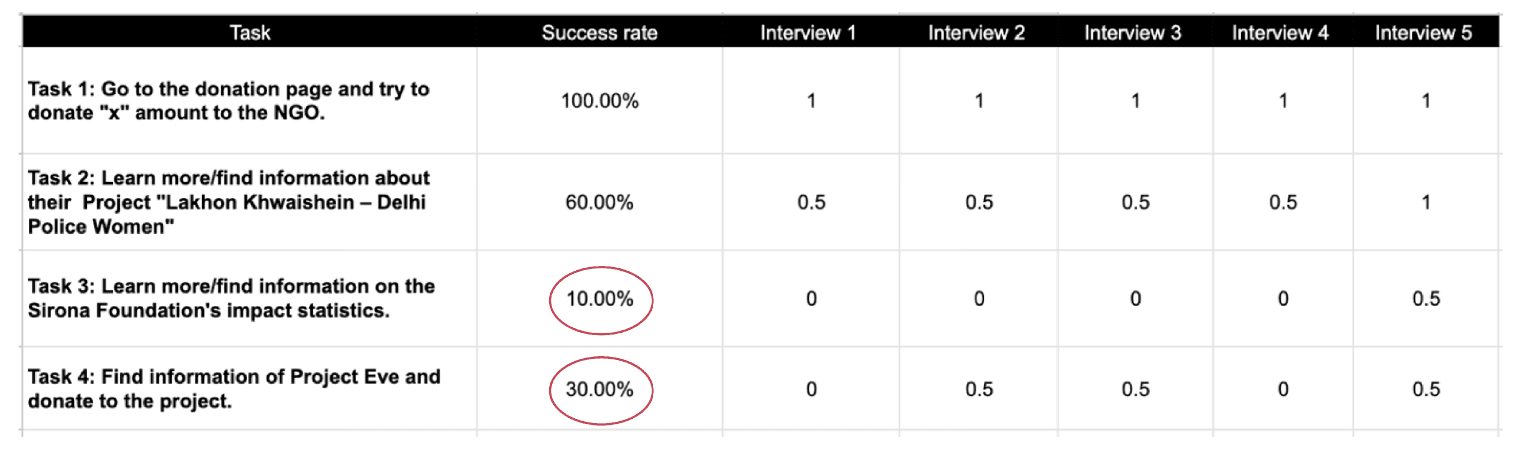
The success rate of the tasks that we did during our usability testing.
The success rate of the tasks that we did during our usability testing.
The success rate of the tasks that we did during our usability testing.
During our think-aloud sessions, the following were major user pain points that we gathered :
During our think-aloud sessions, the following were major user pain points that we gathered :
During our think-aloud sessions, the following were major user pain points that we gathered :

defining the problem
defining the problem
💡 Problem Statement
Users struggle to comprehend Sirona Foundation's projects and seek credible information on their website that effectively communicates their story and transparent impact metrics. This clarity is essential for users to make quick, informed decisions about donating to the cause.
💡 Problem Statement
Users struggle to comprehend Sirona Foundation's projects and seek credible information on their website that effectively communicates their story and transparent impact metrics. This clarity is essential for users to make quick, informed decisions about donating to the cause.
💡 Problem Statement
Users struggle to comprehend Sirona Foundation's projects and seek credible information on their website that effectively communicates their story and transparent impact metrics. This clarity is essential for users to make quick, informed decisions about donating to the cause.
the design process
the design process
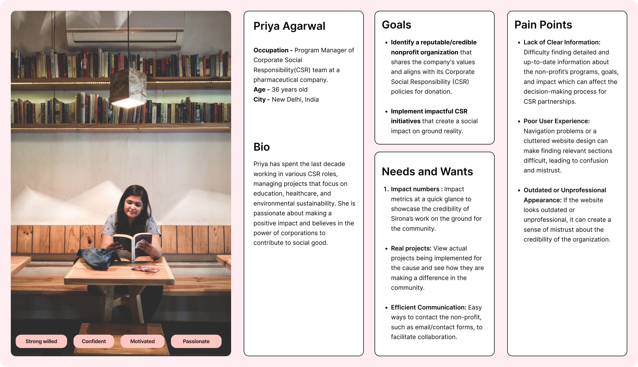
Defining our persona to know who were are designing for.
Defining our persona to know who were are designing for.
Defining our persona to know who were are designing for.
After conducting the interviews, we defined a user persona based on the interviewees’ needs, hesitations, and concerns in their interaction with Sirona’s website. This user persona helped us better understand and address users’ needs and pain points.
After conducting the interviews, we defined a user persona based on the interviewees’ needs, hesitations, and concerns in their interaction with Sirona’s website. This user persona helped us better understand and address users’ needs and pain points.
After conducting the interviews, we defined a user persona based on the interviewees’ needs, hesitations, and concerns in their interaction with Sirona’s website. This user persona helped us better understand and address users’ needs and pain points.
start of the solution
start of the solution
Simplified the information architecture and sitemap for an easier website experience.
Simplified the information architecture and sitemap for an easier website experience.
Simplified the information architecture and sitemap for an easier website experience.
Revamped the main top navigation menu for simplicity and ease of use with Information architecture.
Enhanced the “About Us” page to convey the story and team structure of Sirona.
Introduced a new page for “Our Impact” for a dedicated page for impact metrics.
Streamlined the pages under “Our Work” to enhance user navigation ease.

Prototyping
Prototyping
Testing our Lo-Fi : User confusion when navigating tasks on our lo-fi prototype.
Testing our Lo-Fi : User confusion when navigating tasks on our lo-fi prototype.
Testing our
Lo-Fi : User confusion when navigating tasks on our
lo-fi prototype.
After our initial prototype was ready, we gave it to 5 users for testing and to observe their navigation through the redesigned website.
After our initial prototype was ready, we gave it to 5 users for testing and to observe their navigation through the redesigned website.
After our initial prototype was ready, we gave it to 5 users for testing and to observe their navigation through the redesigned website.

We identified both strengths and weaknesses in our initial design concept.
We identified both strengths and weaknesses in our initial design concept.
We identified both strengths and weaknesses in our initial design concept.

Iterations after user feedback.
Iterations after user feedback.
Iterations after user feedback.
Based on our user insights, we saw an opportunity to simplify project navigation and reassess the placement and necessity of additional donate buttons to enhance user experience.
Based on our user insights, we saw an opportunity to simplify project navigation and reassess the placement and necessity of additional donate buttons to enhance user experience.
Based on our user insights, we saw an opportunity to simplify project navigation and reassess the placement and necessity of additional donate buttons to enhance user experience.

Stakeholders vs Users vs Designers
Stakeholders vs Users vs Designers
Stakeholders vs Users vs Designers
"Why is there this donation button everywhere on screen, when there is one on the top?"
- Anonymous User
Stakeholders had strongly wanted a floating donate button on all screens. We as designers did not agree with that. But instead of saying no for it, we opted for a user-testing approach to validate the decision.
Following user testing, we found that 4 out of 5 users expressed a preference for locating the donate button within the top nav menu rather than having a persistent floating button on the screen.
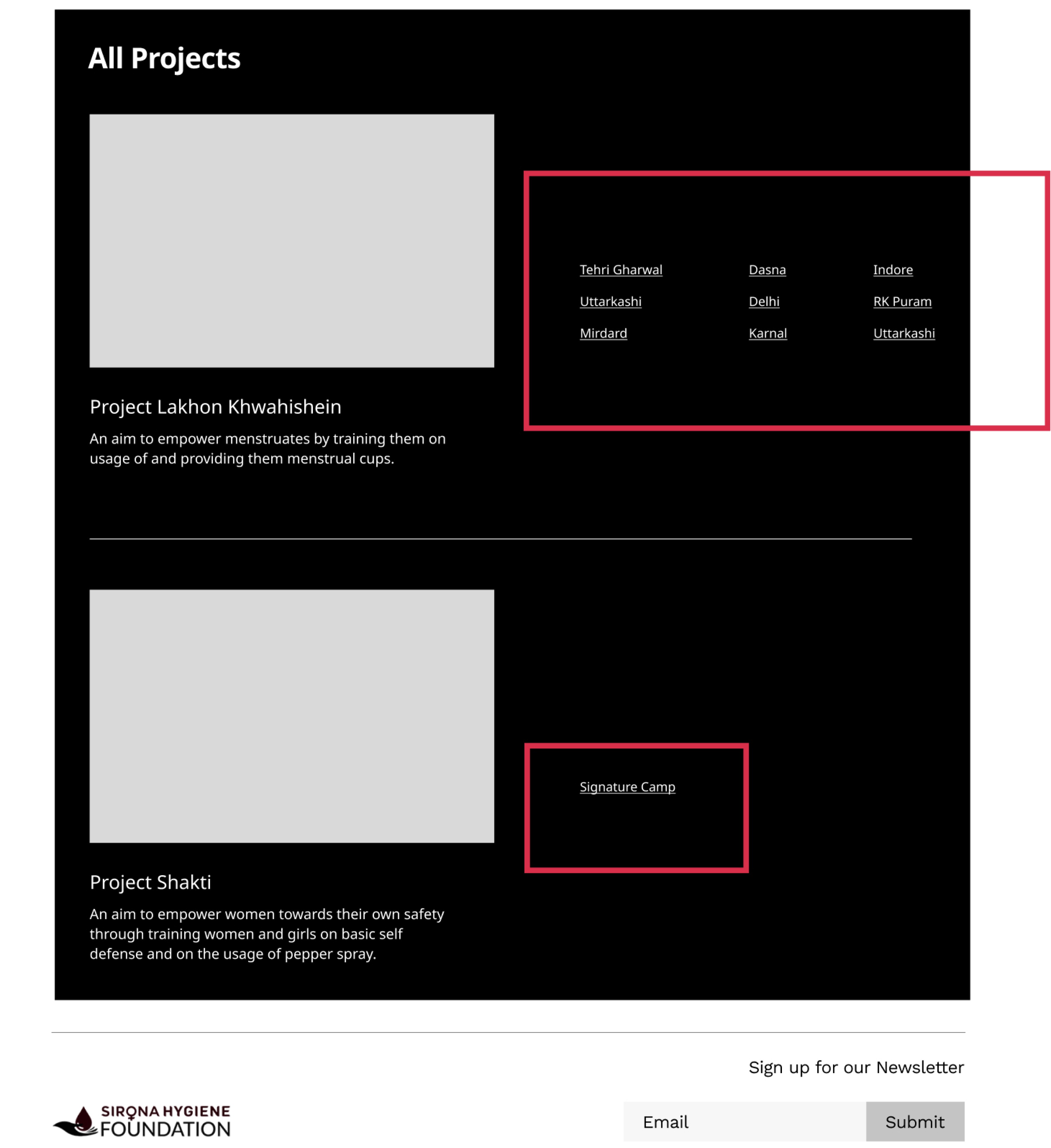
Users were confused with projects on “Our Work”
Users were confused with projects on “Our Work”
Users were confused with projects on “Our Work”
"I am confused about how projects are laid out -
are the locations separate or related to the project?"
- Anonymous User
Redesigning the 'Projects' section under the 'Our Work' page posed significant challenges due to the naming conventions used for projects within the foundation. Consequently, users were understandably confused when navigating through this page.
We had to think hard on how we could highlight the three different categories of Sirona's projects, especially for new users visiting the website.
We had to think hard on how we could highlight the three different categories of Sirona's projects, especially for new users visiting the website.
We had to think hard on how we could highlight the three different categories of Sirona's projects, especially for new users visiting the website.
Sirona has three main categories of projects.
Sirona has three main categories of projects.
Sirona has three main categories of projects.
Project Eve
1 million menstrual cup project - international version
Project Lakhon Khwahishein
Indian version of the 1 million menstrual cup mission.
Project Shakti
Projects towards women self defense and training.
Project Eve
1 million menstrual cup project - international version
Project Lakhon Khwahishein
Indian version of the 1 million menstrual cup mission.
Project Shakti
Projects towards women self defense and training.
Project Eve
1 million menstrual cup project - international version
Project Lakhon Khwahishein
Indian version of the 1 million menstrual cup mission.
Project Shakti
Projects towards women self defense and training.
The individual project pages are categorised and named based on their locations. For example, Project Lakhon Khwahishein Delhi, Project Shakti Indore, etc.
The individual project pages are categorised and named based on their locations. For example, Project Lakhon Khwahishein Delhi, Project Shakti Indore, etc.
The individual project pages are categorised and named based on their locations. For example, Project Lakhon Khwahishein Delhi, Project Shakti Indore, etc.
But there is a problem with this nomenclature system.
But there is a problem with this nomenclature system.
But there is a problem with this nomenclature system.
Users during our usability testing of the prototype were confused navigating through the abundance of names and information, particularly when multiple project names are listed under a single location, such as Delhi, resulting in multiple pages.
It was evident after the user testing that the current method of presenting project page is not sustainable in the long run.
To tackle the above issues, we did major iterations on the “Our Work” page.
To tackle the above issues, we did major iterations on the “Our Work” page.
To tackle the above issues, we did major iterations on the “Our Work” page.
Key design strategies that we incorporated for the for the redesign:
Simplified Navigation Menu- A clear, intuitive top menu helps users find information quickly, improving engagement. Included bios and photos for a personal touch and engagement.
Revamped Homepage with clear storyline - Enhanced to effectively communicate Sirona’s mission and narrative to users.
Dedicated Impact Page - Introduced a dedicated impact page featuring visually presented key impact metrics, along with sections such as "Our Stories" showcasing real-world accounts of how Sirona has positively impacted lives. This fosters visitor engagement by illustrating the tangible impact of Sirona's work.
Enhanced Donate Page - Implemented a major redesign of the donate page to enhance its trustworthiness and credibility.
Streamlined Project Categories - The "Our Work" page now showcases three distinct categories of Sirona's projects, removing the confusion that people had with the website.

UI STYLE GUIDELINES
UI STYLE GUIDELINES
Designing building blocks and a visual style.
Designing building blocks and a visual style.
Designing building blocks and a visual style.
Aimed for clean and minimalist visual design, striving for the professional and international appeal typical of reputable non-profit websites.
Opted for neutral shades of black and white colour scheme.
Incorporated accents of brand's distinctive red and their existing logo for maintaining brand consistency.


the before and after
the before and after
Key design strategies that we incorporated for the for the redesign:
Key design strategies that we incorporated for the for the redesign:
Simplified Navigation Menu- A clear, intuitive top menu helps users find information quickly, improving engagement. Included bios and photos for a personal touch and engagement.
Revamped Homepage with clear storyline - Enhanced to effectively communicate Sirona’s mission and narrative to users.
Dedicated Impact Page - Introduced a dedicated impact page featuring visually presented key impact metrics, along with sections such as "Our Stories" showcasing real-world accounts of how Sirona has positively impacted lives. This fosters visitor engagement by illustrating the tangible impact of Sirona's work.
Enhanced Donate Page - Implemented a major redesign of the donate page to enhance its trustworthiness and credibility.
Streamlined Project Categories - The "Our Work" page now showcases three distinct categories of Sirona's projects, removing the confusion that people had with the website.
Modern Visual Style - Redesigned the website to have a more modern and international aesthetic through updated visual style.


The Outcome 🎉
The Outcome 🎉
The Outcome 🎉
Feedback from Dr Diksha
from Sirona Foundation. 🙏
Feedback from Dr Diksha
from Sirona Foundation. 🙏
Feedback from Dr Diksha
from Sirona Foundation. 🙏
"Kanika was exceptional and very intuitive in our requirements for the website design and development. She has a creative mind and is patient, attentive and truly understood our mission. She was always available to hear our concerns and was comfortable with the repeated iterations in the design based on our team's feedback. Can't recommend her enough!"
"Kanika was exceptional and very intuitive in our requirements for the website design and development. She has a creative mind and is patient, attentive and truly understood our mission. She was always available to hear our concerns and was comfortable with the repeated iterations in the design based on our team's feedback. Can't recommend her enough!"
"Kanika was exceptional and very intuitive in our requirements for the website design and development. She has a creative mind and is patient, attentive and truly understood our mission. She was always available to hear our concerns and was comfortable with the repeated iterations in the design based on our team's feedback. Can't recommend her enough!"
reflections and learnings
reflections and learnings
Stakeholders vs Users vs Designers
Stakeholders vs Users vs Designers
Stakeholders vs Users vs Designers
The floating donate button was controversial- stakeholders wanted it, but we had concerns. Instead of dismissing their idea, we validated it through user testing. Presenting user feedback instead of personal opinions ensured our design choices were based on real data rather than personal preferences. To be honest, I was a little proud of myself as a designer for showcasing this thought process.
The floating donate button was controversial- stakeholders wanted it, but we had concerns. Instead of dismissing their idea, we validated it through user testing. Presenting user feedback instead of personal opinions ensured our design choices were based on real data rather than personal preferences.
To be honest, I was a little proud of myself as a designer for showcasing this thought process.
Don't be married to one solution early on!
Don't be married to one solution early on!
We were initially attached to our ideas for organising the projects page, assuming they were optimal. However, early user testing showed the value of gathering feedback. Letting go of our initial concepts and pivoting based on user insights was critical for better design.
P.S. I still believe we haven't found the best solution for that page yet, and I'd like to continue refining it through more user testing.
If I had more time.
If I had more time.
Don't be married to one solution early on!
Build a dedicated page to educate users about menstrual cups, providing valuable information to newcomers.
Implementing an interactive map view for showcasing the projects of Sirona across India, allowing users to click on specific locations for more details, is an idea I'm eager to explore given more time.
We were initially attached to our ideas for organising the projects page, assuming they were optimal. However, early user testing showed the value of gathering feedback. Letting go of our initial concepts and pivoting based on user insights was critical for better design.
P.S. I still believe we haven't found the best solution for that page yet, and I'd like to continue refining it through more user testing.
If I had more time.
Build a dedicated page to educate users about menstrual cups, providing valuable information to newcomers.
Implementing an interactive map view for showcasing the projects of Sirona across India, allowing users to click on specific locations for more details, is an idea I would like to explore.
More Projects
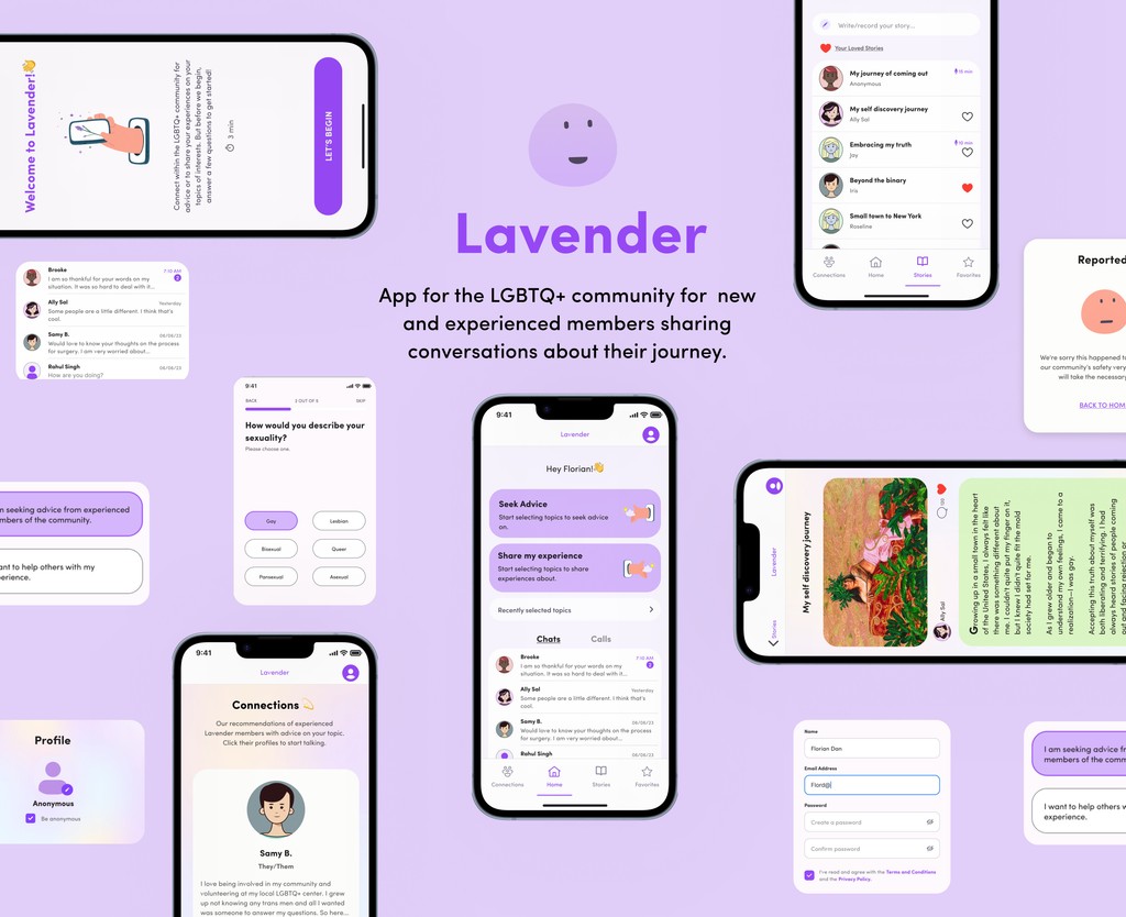
Lavender
→
Using design to bridge the gap for isolated LGBTQ+ individuals.
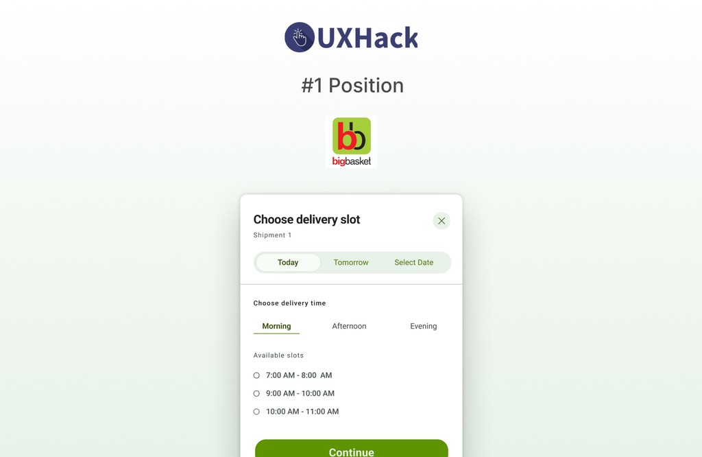
Bigbasket
→
Improving the delivery slot screen to reduce chances of cart abandonment.
Thank you for making it to the end 👋
Let's connect to collaborate and create together.
Thank you for making it to the end 👋
Let's connect to collaborate and create together.
Website redesign
Sirona Hygiene Foundation Redesign
Redesigning the NGO's website to elevate storytelling, highlight impact, and boost CSR donations.
my role
Stakeholder management, User research, Usability testing, Defining metrics, IA, Wireframing, Copywriting, Visual design, Prototyping
team
Kanika Talwar
Steven Tan
I led the design for the desktop
version of the redesign.
Timeline
2023
3 weeks
project summary
This capstone project was completed as part of my UX/UI Bootcamp at UC Berkeley Extension. It involved partnering with a non-profit organization to apply and showcase our UX skills.
As I led this website redesign, we tackled with problems such as the lack of user trust due to the homepage's failure to clearly convey the non-profit's mission/story. Additionally, their website failed to showcase their impact numbers and tangible work, resulting in fewer donations for the cause.
Initially, only 10% of users could even find their impact numbers. But through our extensive user research and thoughtful design, we managed to bring the success rate of this task to over 70%.
Bigbasket
→
→
Improving the delivery slot screen to reduce chances of cart abandonment.
Lavender
→
→
Using design to bridge the gap for isolated LGBTQ+ individuals.
More Projects
To tackle the above issues, we did major iterations on the “Our Work” page.


